
How does your product use or challenge conventions, and how does it represent social groups or issues?
IL FAVORE uses the visual codes of neo-noir and the mafia film accurately enough that an audience places it inside ten seconds, then breaks one convention on purpose.
The codes we kept are all in the first half minute. Low-key chiaroscuro on the card table at 0:06, lit by a single spotlight.
Reference 0:06
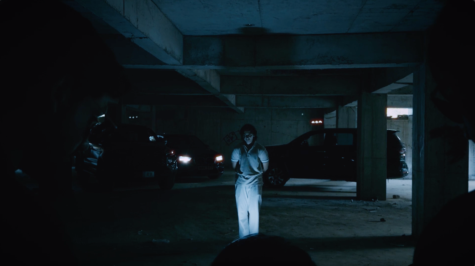
Dark suits, sunglasses indoors, a boss holding cards while two bodyguards stand behind him. A convoy of SUVs coming down the ramp at 1:02. The opening tracking shot at 0:00 stays on shoes climbing marble stairs, so the audience reads money and status before it sees a face. None of that needs explaining because the genre has trained people to read it.
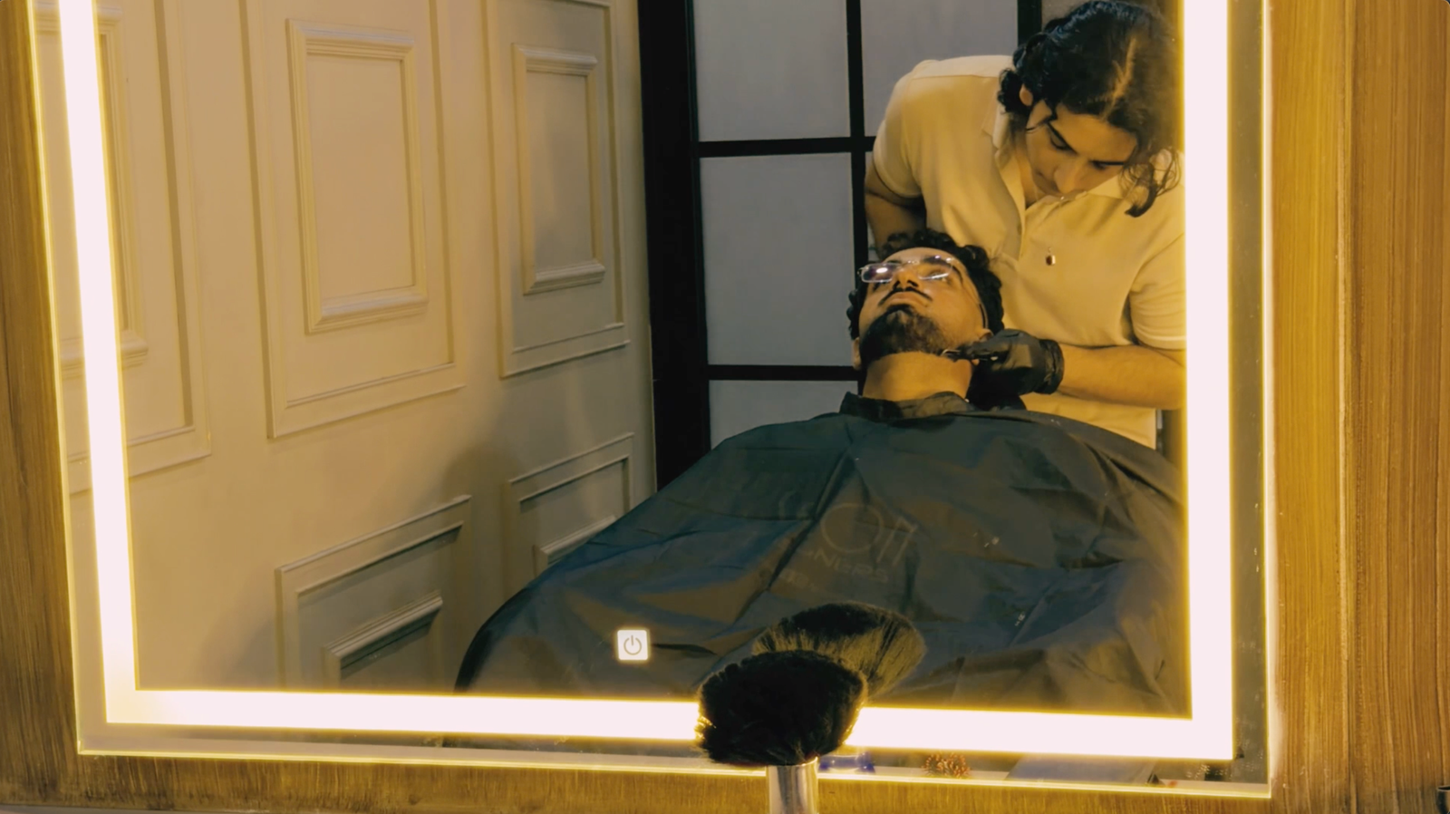
What we changed is where the danger sits. Crime openings almost always put the threat in an alley, a lock-up or a back room. Ours puts it in a bright, expensive barber shop under warm high-key lighting — the safest-looking room in the film. That removes the visual warning an audience relies on.
Reference 1:10
When the capos walk in at 1:29 the lighting scheme itself is what gets invaded, and the contrast between the two schemes does the work that a line of threatening dialogue normally does.
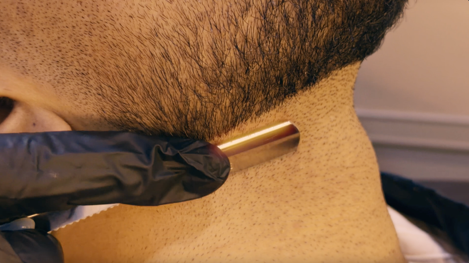
The second departure is that there is no violence. The tensest shots in the film are the two macro extreme close-ups of the razor at 0:53 and 1:24, and in both of them nothing happens. The blade is only shaving. The threat is entirely in what the tool could do, which is a shift from showing violence to implying leverage.
On representation, the film deals with organised power and wealth rather than with ethnicity, and it deliberately avoids the scruffy-criminal stereotype. Everyone in the mafia group is groomed, still and expensively dressed; the boss's authority in the close-up at 0:40 comes entirely from the fact that he does not move and looks straight down the lens. Costume carries the power relationship: the customer is in white, which reads as exposed and easily marked, while the boss arrives at 1:10 in cream — the same palette, but settled and untouchable. One is being looked at. The other is doing the looking, and the mirror shots at 0:36 and 0:59 make that literal by showing the customer watched from angles he cannot see.
The reading we left open is that the film also works as pure style. That is the compromise of working inside a genre this coded: you cannot rely on the iconography to be understood in 110 seconds and dismantle it at the same time.
Awaiting upload